The Xiaomi Mi 11 Review: A Gorgeous Screen and Design
by Andrei Frumusanu on March 10, 2021 8:00 AM EST- Posted in
- Mobile
- Smartphones
- Xiaomi
- Snapdragon 888
- Mi 11
Display Measurement
The display of the Mi 11 is a highlight of the device. A 1440p, 120Hz AMOLED panel is a major step-up in Xiaomi’s device line-up, and is a definitive improvement over past year implementations in the mainline Mi series.
The panel is of a similar generation we’ve seen in last year’s Galaxy S20 series as well as on the OnePlus 8 Pro – more similar to the latter unit as Xiaomi allows 1440p at 120Hz simultaneously. What’s lacking for the device, is any kind of variable refresh rate mechanism, no software based coarse VRR as on the base S21 series, neither a more advanced hardware one as on the S21 Ultra.
Edit March 12th: The Mi 11 does have a coarse software-based refresh rate switching mechanism, however it does not function below 110 nits screen brightness (around 70% on the brightness slider).
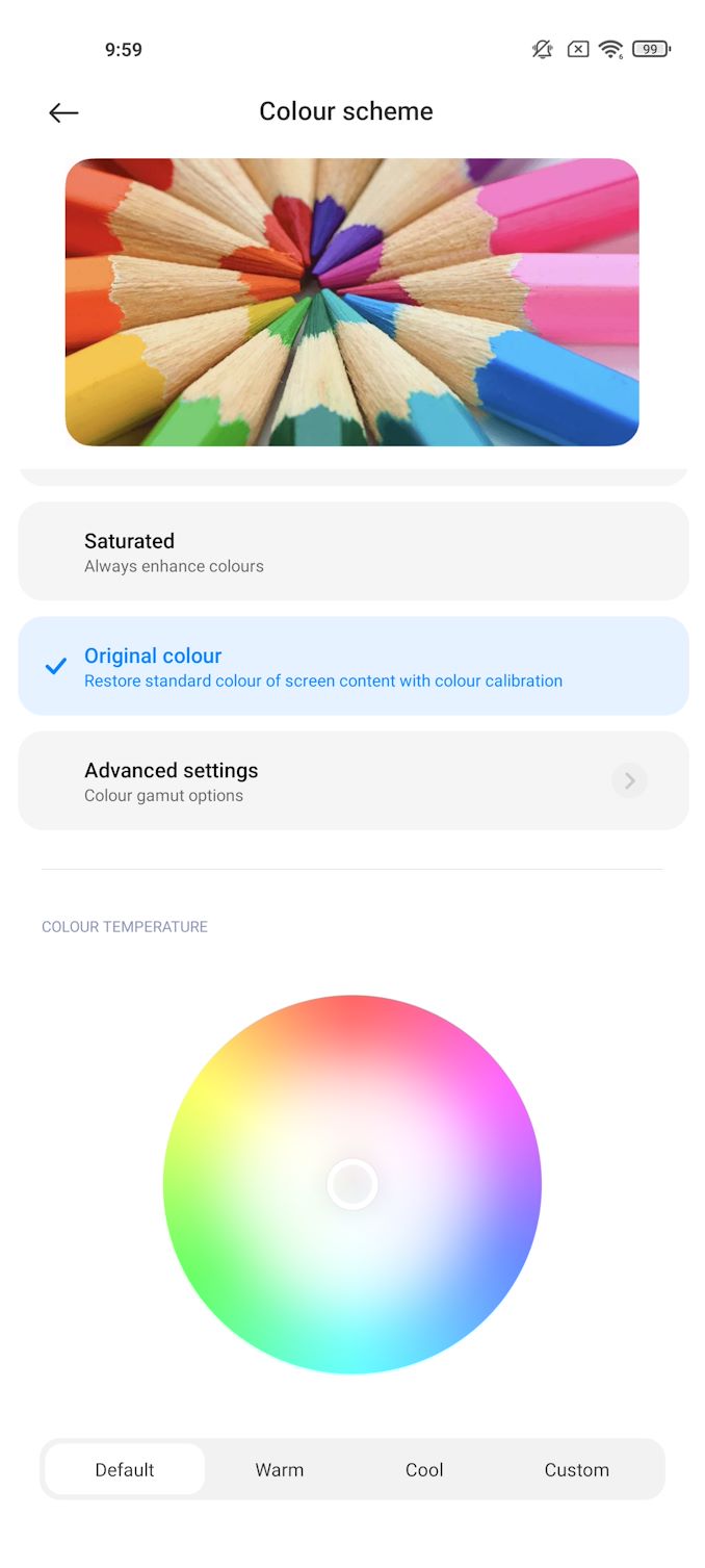
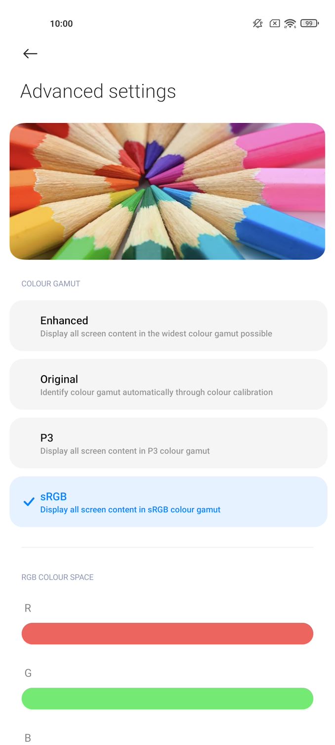
In terms of screen calibration and controls, Xiaomi gets top marks here as the company offers various different default operating modes which offer fine-tuning of the colour temperature, as well as offering an advanced fully custom mode where you can fully control the screen calibration from hue, saturations and even gamma controls. Generally speaking, you are able to set up the display of the Mi 11 however you like it the most, and I applaud such levels of customisation.
What we’re testing today is the “Original colour” mode at its default settings, which is supposed to be a calibrated target to sRGB and P3 standards.
We move on to the display calibration and fundamental display measurements of the Xiaomi Mi 11 screen. As always, we thank X-Rite and SpecraCal, as our measurements are performed with an X-Rite i1Pro 2 spectrophotometer, with the exception of black levels which are measured with an i1Display Pro colorimeter. Data is collected and examined using Portrait Display's CalMAN software.
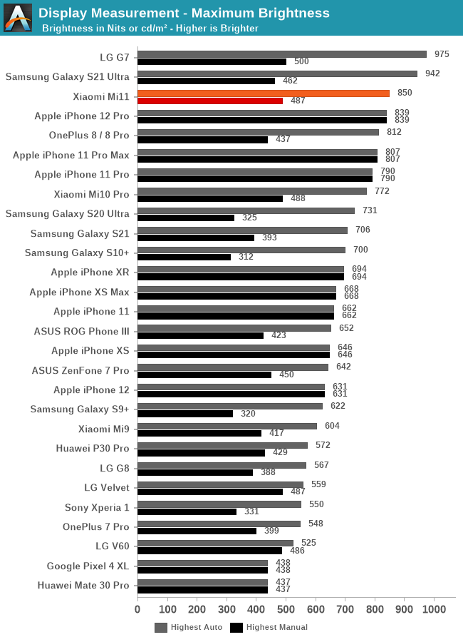
In terms of brightness, the Mi 11 is a top performer. At 850 nits peak full screen white brightness when in auto-brightness and under brightly lit ambient light, the screen only falls behind the newer S21 Ultra which has a superior emitter technology. Under manual brightness, the phone lands in at 487 nits, which is in line with what we’ve seen in the Mi 10 Pro last year.
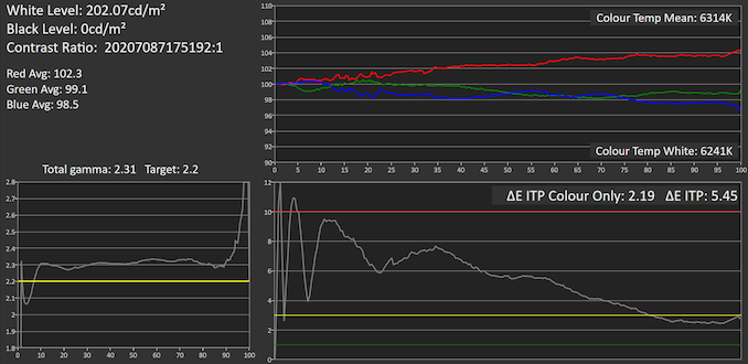
In the greyscale performance, the Mi 11 is quite a bit off the mark in two aspects. First of all, the reds are quite dominant as average colour temperature lands in at 6314K, and whites land in also reddish at 6241K, below an ideal 6505K target for pure daylight white. This gives the Mi 11 a colour dETIP of 2.19.
The more offending discrepancy however is in the gamma, where the Mi 11 apparently targets a 2.3 figure, measuring in at 2.31 average. This is higher than a typical 2.2 calibration, and it means that tones will appear slightly darker than they should be, possibly giving content a little more contrast than what they’re meant to be displayed at. This regresses the overall dEITP to 5.45.
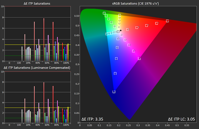
In the saturations, we’re seeing generally good performance in most colours except for the reds and the magentas, which are oversaturated and too dominant, again similar to the too warm colour temperature in the greyscale values.
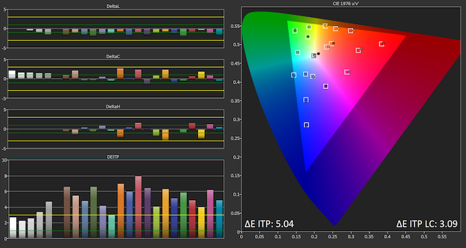
Finally, in the GretagMacbeth patches of commonly found tones such as skin tones, the Mi 11 does averagely. It’s not a total disaster, but we’re seeing the too dark luminance due to the higher gamma, as well as oversaturation in the reds. Both aspects end up with the Mi 11 getting an dEITP of only 5.04.
Generally, the screen of the Mi 11 is still excellent when it comes to its fundamentals – fantastic brightness, contrast, resolution and of course that 120Hz refresh rate. The colour calibration isn’t the best, but it’s still adequate enough, and at least Xiaomi gives you extensive controls to adjust the screen to your liking. At least at this price point, the Mi 11 is able to compete extremely well with just the fundamental characteristics of the display, even if it’s not the most advanced or accurate panel out there.





85 Comments
View All Comments
ZoZo - Wednesday, March 10, 2021 - link
Curved edge screen? Next.yankeeDDL - Wednesday, March 10, 2021 - link
Really? Why? I have an S8 (yes, Samsung S8, 4 years old and counting) with edge screen. It still works perfectly, it is a pleasure to hold and it has some decent edge effects that are actually useful.I'd definitely consider another phone with curved edges.
I look forward to something a tad smaller than this though: 6" for example.
I hate the fact that on Android if you want the top of the line HW you get it only on huge phones.
Wereweeb - Wednesday, March 10, 2021 - link
Because it's terrible to use and distorts images. It's stupid and should stop existing. I say this as a former S6 Edge user (I didn't buy it, it was handed down to me)theblitz707 - Friday, March 26, 2021 - link
thats your opinion. i never had a problem with my curves s10+ and quite like it, it makes the screen look more premium and i never felt a distortion problem when watching videos. in fact compared to 11 pro max, that looks like a phone from years ago.inighthawki - Wednesday, March 10, 2021 - link
Am I the only one who prefers a phone with a flat rectangle for a screen with no curves, notches, or rounded corners cutting off or warping various parts of the display?Wereweeb - Wednesday, March 10, 2021 - link
Eh, rounded corners makes it easier to hold, and doesn't really compromise images that much. I'll take notches over hidden cameras, but otherwise I also dislike them, and prefer pop-up cameras or a camera between the housing and the display.inighthawki - Thursday, March 11, 2021 - link
I guess I mean that I'm fine with having a bezel on the top/bottom for that kind of thing. The phone itself can still have some roundedness on the corners. For example right now I use a pixel 2 and love it. I think they could shrink the bezels without sacrificing the screen being a rectangle.And while the corners dont really compromise much, it's something that forces software developers to work around. For example, if you're right a game, you now have to query APIs to know how rounded the corners are to ensure you aren't putting text or status icons somewhere the user can't see. Like imagine if your desktop's monitor had rounded corners and it forced Microsoft to update the taskbar so that the start button wasn't flush against the edge. It serves no purpose. You're quite literally just losing functionality. And on a phone it's done for no other reason than the bragging rights of claiming the display is 0.2" larger than the previous generation with zero bezels.
inighthawki - Thursday, March 11, 2021 - link
If you're writing a game*Stupid no edit button :(
hanselltc - Thursday, March 11, 2021 - link
minor curved corners are acceptable if it truly helps the phone keep a more handleable shape. if it has a chin and/or a forehead, then it is stupid. other cutouts are all absolutely asinine.MetaCube - Thursday, March 18, 2021 - link
Rounded corners are great, stop smoking glue